


- What Is Product A/B Testing
- Why Most Product A/B Tests Don’t Improve Conversion
- A Product A/B Testing Framework That Actually Works
- What to Test on a Product Page Based on Real Conversion Issues
- Real Examples of Product A/B Tests That Increased Conversion
- How to Run Product A/B Tests on Shopify Without Coding
- Conclusion
- FAQs about Product A/B Testing
Product A/B testing should be the fastest way to improve your product page performance. But for many Shopify merchants, it doesn’t work that way. You run tests, change a few elements, and wait for results… Yet nothing really moves: conversion stays flat, and revenue barely changes.
The problem isn’t that you’re not testing enough. It’s that most product A/B tests are driven by guesswork, not real user behavior. Testing a new CTA copy, swapping images, or tweaking layouts without a clear reason often leads to meaningless results.
This is why so many experiments fail to create real impact.
If your product page isn’t converting, the issue isn’t a lack of ideas. It’s a lack of direction. To get meaningful results, testing needs to start with actual user friction, follow a structured process, and build on real insights.
In this guide, you’ll learn how to turn random product tests into a system that actually drives conversions and revenue.

What Is Product A/B Testing
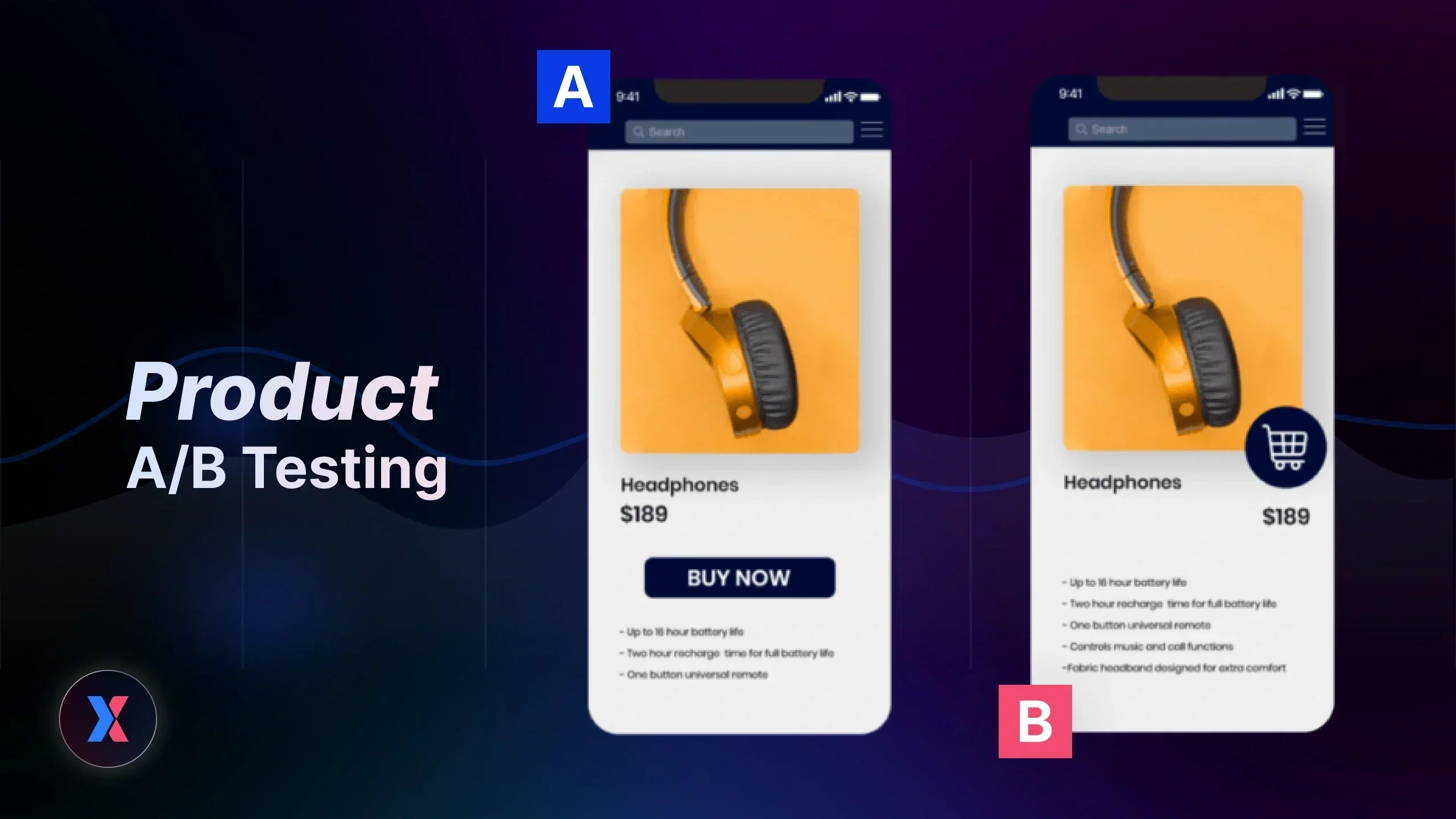
Product A/B testing is the process of comparing two versions of a product page element to see which one leads to better conversion outcomes. But unlike generic A/B testing, it’s not just about testing variations. It’s about testing what actually influences a customer’s decision to buy.
Most A/B testing guides focus on surface-level changes like headlines or button copy. That works for content optimization. But on a product page, user decisions are driven by deeper factors.
Product A/B testing focuses on elements that directly impact purchase behavior, including:
-
How users perceive your pricing
-
How much they trust your product and brand
-
How clearly they understand the product’s value
This is what makes it fundamentally different from generic testing. You’re not just testing content. You’re testing the entire decision-making experience.
For example, changing a CTA color might increase clicks. But improving product clarity or reducing hesitation can increase actual purchases.
That’s the real goal of product A/B testing. Not just better engagement, but measurable impact on conversion rate and revenue.
Why Most Product A/B Tests Don’t Improve Conversion
Most product A/B tests don’t fail because of execution. They fail because they start from the wrong place.
You run experiments, change a few elements, and wait for results. But even when tests reach statistical significance, conversion barely moves and revenue stays flat. The problem isn’t testing itself, it’s how those tests are designed.
Here’s where most product A/B testing goes wrong:
-
Testing without a clear problem: Instead of identifying what’s actually blocking conversion, many tests start with random ideas. Without a defined issue, even a “winning” variation has little impact.
-
Testing opinions, not user behavior: Decisions are often based on assumptions like “this CTA sounds better” rather than real user data. Without understanding how users interact with your page, testing becomes guesswork.
-
Running isolated tests with no learning loop: Each experiment is treated as a one-off task. There’s no system to capture insights, apply learnings, or build momentum from previous tests.
-
Measuring clicks instead of business impact: Focusing on surface metrics like click-through rate can be misleading. More clicks don’t always translate into more purchases or higher revenue.
All of this creates the illusion of progress, but not real growth. You’re running tests, but not solving the underlying problems that affect conversion.
That’s why results often feel inconsistent or insignificant. It’s not a lack of experiments holding you back, it’s the absence of a structured approach that connects testing to real business outcomes.
Learn more: 13+ A/B Testing Mistakes That Hurt Your Store Conversions (And How to Fix Them)
A Product A/B Testing Framework That Actually Works
If most product A/B tests fail because they start with random ideas, then the solution is not to run more tests, but to follow a structured process.
A high-performing product A/B testing strategy is built on a clear sequence where each step is connected to real user behavior and leads to measurable outcomes.
Here’s how that process works:
Step 1: Observe Real User Behavior
Every effective test starts with understanding how users actually interact with your product page.
Instead of relying on assumptions, you need to look at real behavioral data. Tools like GemX make this possible by showing how users scroll, click, and engage with different sections of your page.

Identify the user behavior through your product page with the Click map in GemX.
At this stage, the goal is not to fix anything yet, but to build a clear picture of what is happening.
Step 2: Identify Conversion Issues and What to Test
Once you understand user behavior, the next step is to translate it into concrete problems. This is also where you naturally uncover what to test.
Rather than asking “what should we test next,” you focus on where users are struggling and why.
You can use Heatmap tools to quickly spot patterns such as:
-
Users dropping off before reaching key product information
-
Important sections getting attention but not driving clicks
-
CTAs being visible but ignored
-
Areas where users hesitate or behave inconsistently
These signals point directly to conversion issues.
For example, if users never scroll past your product images, testing CTA copy is unlikely to help. The real issue is that users are not seeing enough value early in the page, which means your test should focus on improving clarity or repositioning key information.
At this stage, test ideas are no longer random. They are directly tied to real problems observed in user behavior.
Step 3: Build a Clear Hypothesis
With a defined issue, you can now form a hypothesis that explains why the problem exists and how to fix it. A strong hypothesis connects cause and effect. Instead of testing vague ideas, you define a clear direction.

An example of a strong & testable hypothesis for the product A/B test.
For example, if users are not engaging because the product value is unclear, then highlighting key benefits earlier in the page should increase interaction.
This clarity ensures that every test has a purpose.
Step 4: Design a Focused Test
Now you create a variation that directly addresses your hypothesis.
Each test should focus on solving one specific issue. Changing too many elements at once makes it difficult to understand what actually influenced the result.
At this stage, testing becomes intentional. You are no longer experimenting randomly, but validating a clear solution.
Step 5: Measure What Actually Matters
After launching the test, it’s important to track the right metrics.
Surface-level metrics like clicks or engagement can be misleading. Instead, focus on outcomes that reflect real business impact, such as add-to-cart rate, checkout progression, or purchases.

You should focus on revenue metrics such as average order value and revenue per visitor.
This ensures that your results are aligned with revenue, not just activity.
Step 6: Analyze Results for Insight
When the test ends, go beyond identifying a winner and focus on understanding why it performed better.
Did users respond to clearer value? Was hesitation reduced? Did the page become easier to navigate?
These insights are what make your next test more effective.
Step 7: Iterate and Build a Testing Loop
The final step is what turns testing into a system.
Each result should feed into the next experiment. Over time, this creates a continuous loop where your product page improves with every iteration.
Instead of running disconnected tests, you build a structured process that consistently uncovers insights and drives conversion growth.
What to Test on a Product Page Based on Real Conversion Issues
When it comes to product A/B testing, most guides will give you a list of elements to test. Headlines, images, buttons, pricing. But testing elements without context rarely improves conversion.
High-performing product page optimization always starts with a specific problem. You don’t test elements. You test the reasons why users are not converting.
Below are the most common product page conversion issues and what you should test to fix them.
Low CTA Engagement
If users are viewing your product page but not clicking the “Add to Cart” button, the issue is not traffic. It’s interaction.
This often happens when the CTA is not visible enough, not compelling enough, or appears at the wrong moment in the user journey.
What to test:
-
CTA copy (benefit-driven vs generic text)
-
CTA placement (above the fold vs after product details)
-
Button contrast and visual hierarchy
-
Sticky CTA vs static CTA
Goal: Make the next action obvious and frictionless.
Weak Product Understanding
If users scroll but don’t convert, they may not fully understand what your product does or why it matters.
This is one of the most common issues in e-commerce product page optimization.
What to test:
-
Product images (lifestyle vs studio vs contextual use)
-
Image order (show value first vs details first)
-
Product description clarity (benefits vs features)
-
Key selling points placement (top vs mid-page)
Goal: Help users quickly understand the value without effort.
Lack of Trust and Credibility
Even if users understand your product, they won’t buy if they don’t trust it. Trust is often the invisible blocker behind low conversion rates.
What to test:
-
Customer reviews placement and format
-
Trust badges (payment security, guarantees)
-
User-generated content (photos, testimonials)
-
Return policies or guarantees visibility
Goal: Reduce perceived risk at the moment of decision.
Price Hesitation
Users often hesitate at the pricing stage, even when they are interested in the product.
This doesn’t always mean your product is too expensive. It often means the value is not clearly justified.
What to test:
-
Price framing (e.g. “only $X/day” vs full price)
-
Discount display (percentage vs absolute value)
-
Bundles or volume pricing
-
Comparison pricing (original vs discounted)
Goal: Make the price feel justified and easier to accept.
Poor Information Flow
Sometimes, it’s not what you show but how you structure it. If users don’t see the right information at the right time, they lose interest before reaching the decision point.
What to test:
-
Section order (value → proof → CTA vs other sequences)
-
Content hierarchy (what appears above the fold)
-
Length and structure of product descriptions
-
Placement of key information (shipping, returns, FAQs)
Goal: Guide users through a clear decision-making path.
How to Turn Issues Into High-Impact Product A/B Tests
Each of these areas represents a common conversion bottleneck. But the key is not to test everything at once.
Start by identifying which issue exists on your product page using real user behavior data. GemX help you pinpoint where users drop off, hesitate, or fail to engage, so you can focus on the highest-impact tests first.
The best product A/B tests don’t start with ideas, but they start with problems.
When you approach testing this way, your experiments stop being random changes and become targeted improvements that directly impact conversion rate and revenue.
Real Examples of Product A/B Tests That Increased Conversion
Understanding what to test is important. But seeing how real product A/B tests work in practice is what helps you apply it effectively.
Below are real-world style examples of product page A/B tests, broken down into what was tested and why it worked.
Example 1: CTA Visibility and Contrast
Before: The product page had a standard “Add to Cart” button placed below the product description with low visual contrast.
What they tested:
-
Moved the CTA higher on the page (above the fold)
-
Increased button contrast
-
Changed copy from “Add to Cart” to a more action-driven version
Result: +18% increase in add-to-cart rate
Why it worked: Users were not ignoring the product. They simply didn’t see or notice the next step clearly. By improving visibility and clarity, the test reduced friction at the decision point.
Example 2: Product Image Strategy
Before: The first product image was a clean studio shot showing only the product.
What they tested:
-
Replaced the first image with a lifestyle image showing the product in use
-
Reordered images to highlight benefits first instead of details

You can replace the first image with a lifestyle image showing the product in use.
Result: +22% increase in product page conversion rate
Why it worked: Users don’t buy products. They buy outcomes. Showing the product in context helped users quickly understand its value, reducing hesitation early in the page.
Example 3: Social Proof Placement
Before: Customer reviews were placed at the bottom of the product page, requiring users to scroll.
What they tested:
-
Moved key reviews and ratings closer to the top
-
Highlighted testimonials near the CTA
Result: +14% increase in purchase rate
Why it worked: Trust signals need to appear at the moment of decision. By placing social proof closer to key action points, the test reduced uncertainty and increased confidence.
Example 4: Price Framing
Before: The product price was displayed as a single full amount with no context.
What they tested:
-
Added a “cost per day” breakdown
-
Highlighted savings compared to original price
-
Introduced bundle pricing options
Result: +12% increase in conversion rate
Why it worked: The issue was not the price itself, but how it was perceived. Better framing made the product feel more accessible and justified the cost.
How to Run Product A/B Tests on Shopify Without Coding
Running product A/B testing effectively is not about setting up experiments. It’s about following a clear workflow based on real user behavior.
Here’s what that looks like in practice when using GemX: CRO & A/B Testing for Shopify.
1. Use Heatmap to Identify a Specific Issue
Start by opening Heatmap for your product page inside GemX.
Instead of trying to analyze everything, focus on patterns that indicate friction. In most cases, these patterns show up very clearly:
-
A large portion of users stop scrolling before reaching key product information
-
Certain sections get attention but do not lead to clicks
-
The CTA is visible but consistently ignored
-
Users hesitate or move back and forth in specific areas

You can access both Click map and Scroll map inside the GemX Heatmap.
When you see these signals, you are no longer guessing what might be wrong. You are identifying where the conversion flow breaks.
Example: You notice that 70% of users never scroll past the first product image, and your CTA sits below that section.
Issue: It becomes clear that the issue is not your CTA, but the lack of value communicated early in the page.
At this point, you don’t need ideas yet. You already have a clear issue: Users are not reaching the decision point.
2. Create a Variation That Solves That Exact Problem
Once you identify a friction point, the next step is to translate it into a focused test direction. Instead of asking what you should test, you are now asking what needs to be fixed.
Using the previous example, if users are not reaching the CTA, the goal is to bring key information higher and make the value clearer from the start.
With GemX’s native integration with GemPages, you can immediately create a variation and apply targeted changes such as:
-
Moving the CTA higher in the layout so it appears above the fold
-
Adding a short, benefit-driven headline near the top
-
Replacing the first image with a lifestyle visual that shows the product in use
-
Introducing key benefits right under the product title

You can duplicate the original page and make changes in minutes with the drag-and-drop visual editor.
Because everything works with a drag-and-drop editor, these adjustments can be made quickly without writing code, allowing you to focus entirely on solving the problem rather than implementing the change.
Important note: Always remember that you are not redesigning the page. Instead, you are solving one problem.
3. Split Traffic and Segment Your Test
After creating your variation, you can set up the experiment directly in GemX and control how traffic is distributed.
At this stage, the goal is not just to compare two versions, but to ensure that the data you collect reflects real user behavior. A typical setup includes:
-
Assigning the original page as Version A and the modified page as Version B
-
Splitting traffic evenly to maintain a fair comparison
-
Segmenting users based on device, traffic source, or audience type

Use the advance settings tab to segment your target audience & market.
Segmentation becomes especially useful when behavior differs across groups. For example, if most of the drop-off happens on mobile, analyzing mobile performance separately can reveal insights that would be hidden in overall averages.
4. Run the Test and Track Real Conversion Metrics
Once the experiment is live, the focus shifts to tracking performance and understanding how each variation affects conversion.
Instead of relying on surface-level engagement, you should monitor metrics that reflect actual business outcomes:
-
Add-to-cart rate to measure intent
-
Conversion rate to measure completed actions
-
Revenue per visitor to measure real impact

These metrics give you a clearer picture of whether a variation is actually improving your product page performance, not just increasing activity.
5. Analyze Why It Worked (Not Just What is the Winner)
Now you have a winning variation, but don’t stop at the result. Instead, it’s better to go deep dive into the data:
-
Did users interact more with the top section?
-
Did scroll depth increase?
-
Did mobile users improve more than desktop?
Example insight: Users converted more because they saw product value earlier, not because of the CTA itself.
6. Turn That Insight Into Your Next Test
The final step is where most product A/B testing efforts break down. Instead of continuing the process, many teams stop after one experiment.
In a structured workflow, each result becomes the starting point for the next test. Based on what you learn, you can define new directions such as:
-
Testing different value propositions in the top section
-
Experimenting with how benefits are structured or presented
-
Introducing social proof earlier in the page
Over time, this creates a continuous loop where each test builds on previous insights.
Key takeaway: With GemX, your product A/B tests are no longer a series of disconnected experiments. It becomes a system where every action is tied to real user behavior, every test solves a specific problem, and every result contributes to long-term conversion growth.
Conclusion
Product A/B testing is not about running more experiments. It is about running the right ones with a clear purpose behind every change.
Most product pages don’t struggle because of a lack of ideas, but because testing is disconnected from real user behavior. When you shift from guessing to understanding how users interact with your page, every test becomes more focused, more meaningful, and more impactful.
Instead of testing random elements, you start identifying real conversion issues, validating solutions, and building a system that improves over time. This is how product A/B testing evolves from isolated experiments into a reliable way to increase conversion rate and drive revenue growth.
If you want to stop guessing and start making decisions based on real data, it’s time to turn your testing into a structured process.
Install GemX today and start running product A/B tests that actually drive results.
FAQs about Product A/B Testing


