


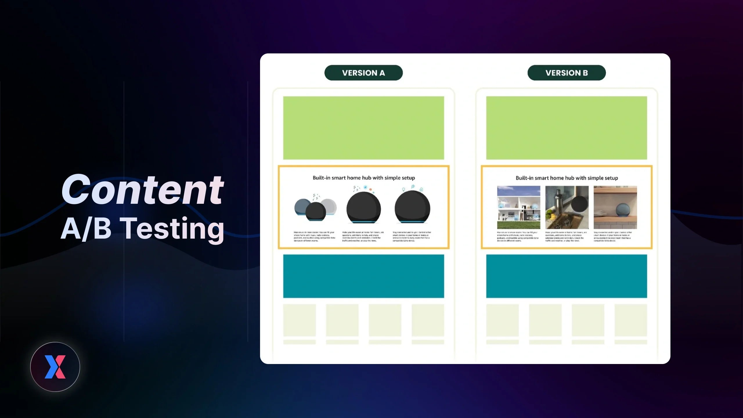
Most Shopify merchants know they should be doing content A/B testing. But in reality, a lot of tests look like this: change a headline, tweak a CTA, swap a few words, etc., then wait and hope something improves.
The problem? Nothing really changes, or worse, you get a “winner” but have no idea why it worked.
If that sounds familiar, you’re not alone. Many stores run content A/B testing without a clear system. They test random ideas, skip real user data, and end up with results that don’t translate into consistent growth. Over time, testing starts to feel like guesswork instead of a reliable way to improve conversions.
Here’s the truth: It’s not that content A/B testing doesn’t work. It’s that most merchants are testing the wrong things, in the wrong way, without connecting it to actual customer behavior.
In this guide, you’ll learn how to approach content A/B testing with a structured, data-driven framework. We’ll break down what content you should test, how to turn insights into meaningful experiments, and how to build a testing loop that actually drives revenue, not just small, random wins.

Why Most Content A/B Tests Fail
Many teams run A/B testing for content with good intentions, but without a clear structure behind it. Over time, tests start to feel random, results become hard to trust, and it’s difficult to build on what you’ve learned.
Let’s break down the root causes.
Testing Random Content Ideas
A lot of content A/B testing starts with ideas like:
-
“Let’s try a different headline”
-
“Maybe this CTA sounds better”
-
“What if we shorten the copy?”
At first glance, this feels like testing. But in reality, it’s just guessing.
Without a clear hypothesis, you’re not learning anything. Even if one variation wins, you won’t know why it worked, which means you can’t apply that insight to future tests.
Ignoring Real User Behavior Data
Another major gap is running tests without understanding how users actually interact with your pages.
Many merchants skip analyzing the real user behavior through their online store. And this leads to a common problem: you end up testing the wrong thing, such as:
-
You rewrite a headline, but users never scroll far enough to see it
-
You adjust product descriptions, while the real drop-off happens above the fold
-
You tweak CTA wording, but the button isn’t getting attention in the first place
When content experiments aren’t grounded in real behavior, you’re essentially optimizing in the dark. Changes might look better internally, but they don’t address actual friction in the customer journey.
Measuring the Wrong Metrics
Another reason many tests fall short is the way success is measured. It’s easy to focus on surface-level metrics like clicks, page views, or time on page. These numbers can give signals, but they don’t always reflect meaningful impact.

Surface-level metrics like page views don't bring meaningful impacts for revenue.
What matters more is how your content affects:
-
Conversion rate
-
Add-to-cart actions
-
Revenue per visitor
If your A/B testing for copy and messaging isn’t tied to these outcomes, you risk choosing a “winner” that doesn’t actually improve business performance.
No Iteration or Learning Loop
One of the biggest gaps isn’t during the test, but after it ends. For many stores, the process stops at choosing a winner. There’s no deeper analysis, no documentation of insights, and no clear direction for what to test next.
As a result, each new test starts from scratch again, and improvements don’t compound over time.
Key takeaway: Most content tests fail not because of the tool, but because there’s no structured system behind them. Once you fix the way you approach testing, the results become much easier to trust and scale.
What Content Should You A/B Test on Your Website
Not every piece of content has the same impact on conversions. Some elements directly influence whether a visitor clicks, scrolls, or buys. Others barely move the needle. The goal of content A/B testing is to focus on the parts of your page that shape decisions.
#1. Headlines and Hero Messaging
Your headline is often the first thing visitors see. It sets expectations and determines whether they stay or leave within seconds. Even small changes in messaging can shift how users perceive your offer.

For example:
-
Generic: “High-quality skincare products”
-
Benefit-driven: “Clearer skin in 7 days without harsh chemicals”
Both say something similar, but the second version is more specific and outcome-focused.
Testing different headline angles helps you understand:
-
What value resonates most
-
How clearly your offer is communicated
-
Whether your messaging matches user intent
If your store struggles with low engagement or high bounce rates, this is usually the first place to look.
#2. Call-to-Action (CTA) Copy
Your CTA is where intent turns into action, but many stores treat it as an afterthought. Even simple changes in wording can influence how users respond, such as:
-
“Buy now” vs “Get yours today”

-
“Start free trial” vs “Try it risk-free”
The difference is subtle, but it shifts the tone from transactional to benefit-driven.
Beyond wording, placement also matters. You can try these ideas:
-
Above the fold vs below product details
-
Sticky CTA vs static button
Testing CTA variations helps you identify what motivates users to take the next step, and where friction exists in the decision process.
Pro tip: For many stores, improving CTA performance is one of the fastest ways to lift conversion rates.
Learn more: GemX Use Case Series: A/B Test the CTA Copy "Sign up for Free" vs "Trial for Free"
#3. Product Descriptions
Product pages are where hesitation happens. Visitors are looking for clarity, reassurance, and a reason to buy. This is where A/B testing copy becomes especially valuable.
Yet many descriptions fall into one of two extremes: (1) too short, lacking detail, or (2) too long, but focused only on features.

Image source: YourCX
You can test:
-
Short vs long descriptions
-
Feature-driven vs benefit-driven messaging
-
Bullet points vs storytelling format
For example:
-
Feature-focused: “Made from 100% organic cotton”
-
Benefit-focused: “Soft, breathable fabric that keeps you comfortable all day”
The second version connects more directly to the customer experience.
Testing different approaches helps you understand what reduces hesitation and drives add-to-cart actions.
#4. Social Proof and Trust Signals
Trust plays a huge role in conversion, especially for new visitors. Elements like customer reviews, testimonials, trust badges, and user-generated content can all influence how confident someone feels about buying.

But it’s not just about having social proof, it’s about how you present it.
You can test:
-
Positioning (above vs below the fold)
-
Format (text vs visual reviews)
-
Volume (a few strong testimonials vs many short ones)
For example, moving a review section closer to the CTA can often reduce friction right before the decision point. These small adjustments can have a noticeable impact on conversion rate.
Learn more: GemX Use Case Series: Adding the Reviews Section Above-the-Fold
#5. Content Structure and Messaging Flow
Beyond individual elements, the way your content is structured also matters. Think about how your page tells a story:
-
Do you lead with product features or customer outcomes?
-
Is your value proposition clear early on?
-
Are key objections addressed before the CTA appears?
You can test:
-
Section order
-
Length of each section
-
Direct selling vs storytelling approach
For instance, placing social proof earlier on the page can build trust faster. Or simplifying the layout can reduce cognitive load and help users move through the page more easily.
These tests are less about single words and more about the overall experience.
A Practical Framework for Content A/B Testing That Drives Results
The difference between random experiments and consistent growth comes down to one thing: having a clear system behind your content A/B testing.
Most Shopify merchants don’t struggle because they lack ideas. They struggle because their tests feel disconnected. One experiment doesn’t lead to the next, and insights don’t build on each other over time.
To fix that, you need a framework that connects user behavior, hypotheses, and execution into a continuous loop.
Step 1: Start With Real User Behavior
Every strong test begins with a problem grounded in data, not a guess.
Instead of asking “What should we test next?”, focus on how users actually behave on your page. Where do they lose interest? Which sections get ignored? At what point do they drop off before taking action?
In most cases, you’ll start seeing patterns like:
-
Users don’t scroll past the hero section
-
Product details are viewed, but add-to-cart stays low
-
CTA buttons are visible but rarely clicked
These signals point directly to where your content may be underperforming.
For example, if visitors drop off early, your headline or opening message might not clearly communicate value. If they reach the CTA but don’t click, the issue could be weak copy or a lack of trust.
Pro tip: You can use GemX to surface these insights by combining heatmap tracking with page analytics, so you can quickly identify what’s worth testing instead of shooting in the dark.
Step 2: Turn Insights Into a Clear Hypothesis
Once you’ve identified a friction point, the next step is to translate that insight into a testable idea.
This is where many A/B testing for content efforts fall short. Merchants often jump straight into testing without clearly defining what they expect to change.
A strong hypothesis gives your test direction. It connects three things:
-
The problem you observed
-
The change you want to make
-
The outcome you expect

You can use a template to form your hypothesis quickly.
In simple terms, you’re saying:
| If we change [this part] of the content, a [specific metric] should improve because it addresses a [known issue]. |
For example, if your hero section has low engagement, you might test a more benefit-driven headline. If users hesitate near the CTA, you might experiment with more persuasive or reassuring copy.
This step ensures your content experiments are not random. Each test is tied to a clear goal, making the results much easier to interpret and reuse.
Step 3: Create Variations That Actually Matter
It's a key to aware that not all changes are worth testing.
One of the biggest mistakes in content A/B testing is making adjustments that are too small to create a meaningful difference. If both versions feel nearly identical, your results will likely be inconclusive.
Instead, focus on testing different approaches to communication.
For example, you can test:
-
Headline angles: feature-focused vs benefit-driven
-
CTA messaging: generic action vs outcome-based language
-
Product descriptions: short and direct vs detailed storytelling

These variations challenge your current assumptions and help you understand what truly resonates with your audience.
This is where copy testing becomes valuable. You’re not just tweaking words, you’re exploring different ways to present value. And that’s what leads to clearer insights and stronger improvements in conversion rate.
Step 4: Run the Test With a Clean & Controlled Setup
Even strong ideas can fail if the test isn’t executed properly.
To get reliable results from your content A/B testing, you need to keep the setup clean and controlled. That means focusing on one key change at a time and ensuring both variations receive a fair share of traffic.
A solid setup usually includes:
-
Testing one primary variable per experiment
-
Splitting traffic evenly between variations
-
Running the test long enough to collect meaningful data

Cutting tests too early or changing too many elements at once makes it difficult to trust the outcome.
For Shopify merchants, speed also matters. The easier it is to launch and manage tests, the more consistently you’ll run them.
With GemX, you can set up and run content split testing directly on your pages without technical overhead, which helps you move from idea to execution much faster.
Learn more: How to Install GemX and Set Up Your First Test in Minutes
Step 4: Analyze Results Beyond "Winner" vs "Loser"
When a test ends, the goal isn’t just to pick a winner. It’s to understand what the result actually means.
| Many merchants stop at surface-level conclusions: Version B performed better → implement it → move on. |
But this approach misses the real value of testing.
Instead, take a step back and look deeper:
-
Which metric improved the most?
-
How did user behavior differ between variations?
-
What does this reveal about your audience?
For example, if a benefit-driven headline outperforms a feature-focused one, it suggests your audience responds more to outcomes than specifications. That insight can then be applied across other pages and future tests.
This is how content optimization through testing becomes scalable. Each experiment adds to your understanding of what drives conversions.
Step 6: Build a Continuous Testing Loop
The final step is what turns testing into a long-term growth engine.
Instead of treating each experiment as a one-off, you want to create a system where every result feeds into the next test.
In practice, this looks like:
-
Identify a friction point
-
Form a hypothesis
-
Run an experiment
-
Analyze the results
-
Use insights to plan the next test
Over time, this loop creates a compounding effect. Small improvements start stacking up, and your decisions become more data-driven with each iteration.
Important note: The faster you can move through this loop, the greater the impact. With GemX, you can go from insight to live test and then to implementation much faster than ever.
Real Examples of Content A/B Testing (Shopify Use Cases)
Once you move beyond theory, the real value of content A/B testing comes from how it’s applied in real scenarios.
Below are practical Shopify use cases where content changes were driven by specific user behavior issues, not random ideas. Each example shows exactly what was tested, why it was tested, and what impact it created.
Low Engagement on Hero Section → Headline Repositioning Test
A Shopify store noticed that most users were landing on the page but leaving within a few seconds. Heatmap data showed:
-
Very low interaction on the hero section
-
Users were not scrolling past the first fold
This pointed to one issue: the opening message wasn’t strong enough to hold attention.
Test setup:
-
Version A: feature-focused headline describing the product
-
Version B: benefit-driven headline highlighting a clear outcome

A benefit-driven headline that you can test
Result after test:
-
+18% increase in click-through rate to product section
-
Reduced bounce rate on landing page
Key insight: Users didn’t respond to product descriptions. They responded to outcomes. Making the value clearer in the first 3–5 seconds had a direct impact on engagement.
Users Reaching CTA But Not Clicking → CTA Copy Test
Another store saw strong scroll depth and product engagement, but conversion rate stayed flat. Data showed:
-
Users were reaching the CTA
-
But click rate on the button was lower than expected
This indicated hesitation at the decision point.
Test setup:
-
Version A: “Buy Now”
-
Version B: “Get Yours Today”

Result after test:
-
+11% increase in conversion rate
-
Higher click-through rate on mobile
Key insight: The issue wasn’t visibility. It was messaging. A more natural, benefit-aligned CTA reduced friction and made the action feel easier to take.
High Product Page Views But Low Add-to-Cart → Description Test
A product page had solid traffic and engagement, but add-to-cart rate was underperforming.
Behavior data showed:
-
Users were scrolling through the page
-
Time on page was relatively high
-
But drop-off happened before taking action
This suggested that users were interested, but not convinced.
Test setup:
-
Version A: feature-heavy product description
-
Version B: benefit-driven, scenario-based storytelling
Result after test:
-
+9% increase in add-to-cart rate
-
Increased scroll depth across product content
Key insight: Users didn’t need more information. They needed to understand how the product fits into their life. Framing the content around outcomes helped reduce hesitation.
Users Skipping Social Proof → Content Structure Test
In another case, a store had strong customer reviews, but they were placed near the bottom of the page.
Heatmap analysis revealed:
-
Many users never reached the review section
-
Drop-off happened before trust signals appeared
This meant valuable content existed, but users weren’t seeing it.
Test setup:
-
Version A: reviews placed near the bottom
-
Version B: reviews moved right below product introduction
Result after test:
-
+14% increase in conversion rate
-
Lower drop-off before CTA
Key insight: The problem wasn’t the content itself. It was the placement. Showing trust signals earlier helped reduce friction at the right moment.
GemX makes it easier to identify these patterns through heatmaps and behavior tracking, so you can test structural changes based on real data instead of assumptions.
Key takeaway: The strongest tests usually come from:
1. Identifying a clear friction point
2. Making a focused content change
3. Measuring impact on a meaningful metric
Once you follow this approach, testing becomes much more predictable. You’re no longer guessing what might work. You’re responding directly to how users interact with your store.
How to Find What Content to Test Using Real User Behavior
At this stage, the biggest shift you need to make is simple: from “What should we test?” to “What are users already telling us?”
The fastest way to answer that is by looking at real behavior data. And instead of stitching together multiple tools, you can do this directly inside GemX.
Use Click map to Spot Where Content Breaks
One of the quickest ways to identify what to test is by looking at how users actually interact with your page.
With GemX Heatmap, you can immediately see which parts of your content attract attention and which ones get ignored. This removes a lot of guesswork.

Access the click map in GemX Heatmap to identify which element has less interaction
In practice, a few patterns tend to show up very clearly.
Sometimes, the hero section gets very little interaction. Users land, scan quickly, and leave without engaging. In other cases, users spend time around product images but skip over your value proposition. You may also notice that CTA buttons are visible but barely clicked.
Each of these signals points to a different type of issue.
-
Low attention: Usually means your messaging is not clear or relevant enough
-
High attention without action: Often suggests the content is interesting but not persuasive
-
Ignored sections: Often indicate a problem with placement or structure
Instead of coming up with ideas from scratch, you’re using real interaction data to guide your content A/B testing decisions from the start.
Use Scroll Behavior to Understand Content Visibility
Another common blind spot in A/B testing for content is optimizing sections that users never even reach.
With Scroll Map tracking inside GemX, you can see how far users actually move through your page and where engagement drops.

Use Scroll map in GemX to keep track with the users' scroll behavior
This often reveals issues that are not obvious from conversion data alone. For example, a large portion of users may never reach your product benefits or review section. Or engagement may drop sharply right before a key conversion point.
These insights shift how you approach testing.
Instead of rewriting content blindly, you can focus on making structural adjustments. Moving high-impact sections higher, shortening blocks that lose attention, or reordering the flow so key messages appear earlier can often create immediate improvements.
This is where content structure testing becomes just as important as copy testing.
Identify Conversion Friction With Page Analytics
Beyond clicks and scroll depth, you also need to understand where users hesitate in the journey.
With page-level analytics in GemX, you can connect user behavior directly to performance metrics like conversion rate or add-to-cart rate.

Get full detailed analytics of any store page with GemX
This makes it much easier to pinpoint where friction actually exists.
For instance, you might see that users reach the CTA but don’t convert, or that product pages get traffic but struggle to generate add-to-cart actions. In some cases, users engage with the content but still don’t move forward, which often points to unclear messaging or missing trust signals.
Once you identify these patterns, turning them into test ideas becomes straightforward, such as:
-
A weak CTA becomes a copy test
-
Hesitation becomes a trust signal test
-
Strong engagement but low conversion becomes a messaging refinement
At this point, your content experiments are no longer based on guesses. They are directly tied to real user behavior and business outcomes.
Key takeaway: It's time to stop guessing, and let your users show you what to test, then act on it.
Learn more: How to Use Page Analytics to Improve Low-Conversion Page
Conclusion
Content plays a direct role in whether visitors convert or leave. But without a clear system, most content A/B testing efforts end up feeling random and hard to scale.
The difference comes from how you approach it. When you start with real user behavior, turn insights into hypotheses, and run structured experiments, testing becomes a reliable way to improve performance, not just a series of isolated guesses.
Over time, small wins compound. Better headlines increase engagement. Stronger CTAs lift conversions. Clearer product messaging reduces hesitation. And each test gives you insights you can reuse across your store.
If you want to move faster and make every test count, tools like GemX help you connect behavior data, experiments, and results in one place.
Install GemX today and start turning your content into a consistent conversion driver.
FAQs about Content A/B Testing


