


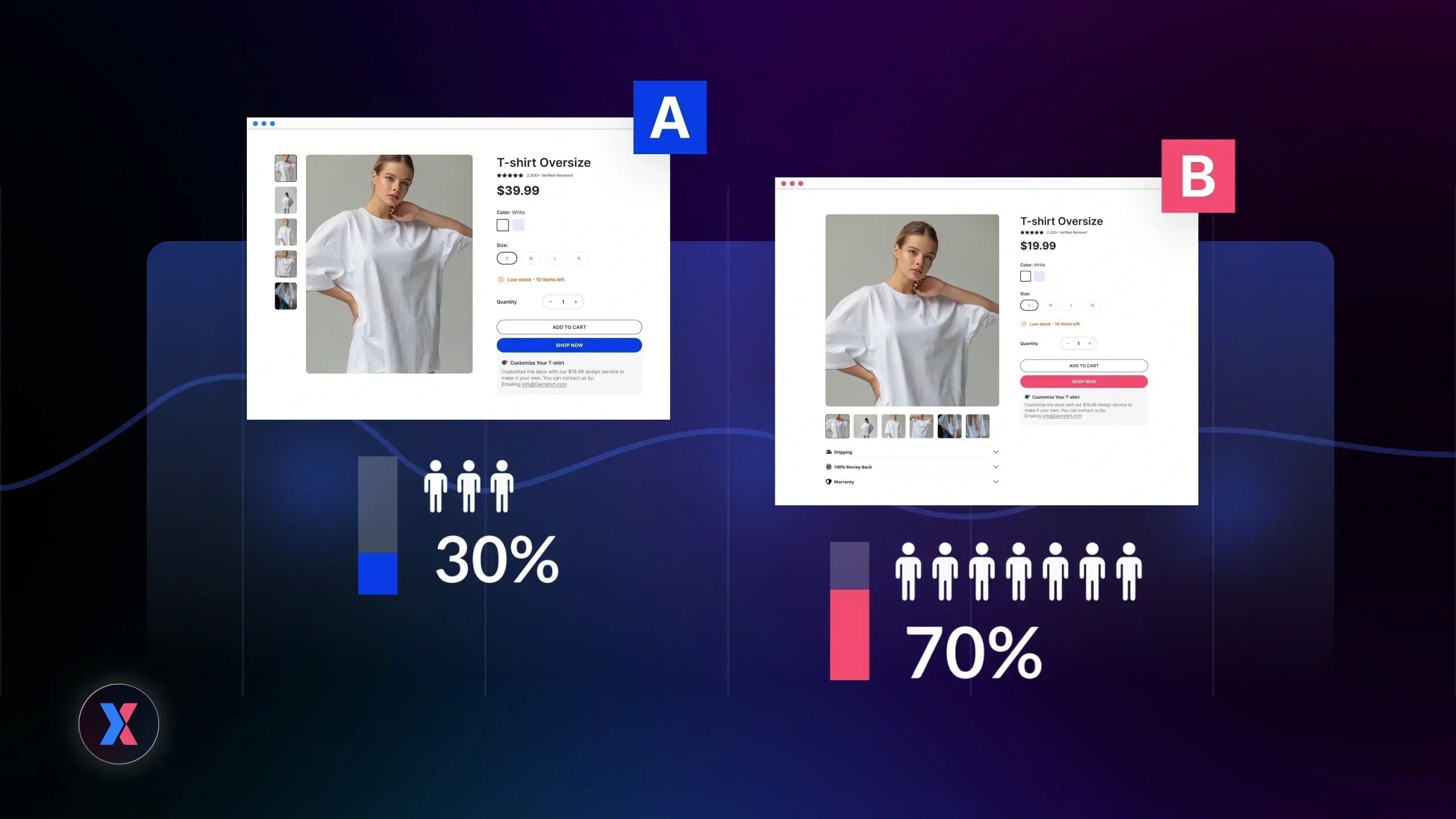
A/B testing sounds simple in theory: change one element, measure the impact, pick a winner. But in practice, most experiments either deliver marginal gains or no clear insight at all.
The difference isn’t luck. It’s structured.
Behind every meaningful conversion lift is a clear hypothesis, a specific friction point, and a measurable business outcome. In this article, let’s break down 15 A/B testing case studies that generated real results, along with the thinking behind each win.
Not just what changed, but why it worked, and how you can apply the same logic to your own experiments.
Ready to dive in?

What Makes High-Impact A/B Testing Case Studies Different
Search “A/B testing case studies” and you’ll find dozens of examples claiming impressive conversion lifts. But a percentage increase alone doesn’t tell the full story.
Some A/B testing examples are one-off wins. Others reveal patterns that can be replicated across pages, funnels, and even industries.
Before we jump in the best case studies below, here’s what separates meaningful experiments from random split testing.
1. Start with a Clear Hypothesis, Not a Random Change
Strong A/B testing case studies don’t start with “let’s try this”, they start with a problem.
Maybe users hesitate before clicking “Buy Now.”
Maybe check out abandonment spikes on mobile.
Maybe traffic is high, but trial sign-ups are low.
The best experiments follow a simple logic:
-
Identify friction
-
Introduce one focused change
-
Predict the impact on conversions

That structure turns a design tweak into a measurable test.
Without it, A/B testing becomes cosmetic experimentation. And cosmetic changes rarely move revenue in a predictable way.
2. Statistical Confidence Before Calling It a Win
Another common issue in many published testing examples is declaring the winner too early.
Conversion rates fluctuate naturally. Traffic mix shifts. Seasonality influences behavior. When sample sizes are small, even minor changes can appear significant when they’re not.
High-impact split testing runs long enough to reach statistical confidence before scaling a variation. This ensures the observed lift is unlikely due to random variation.
Credible A/B testing case studies typically clarify:
-
Test duration
-
Sample size
-
Confidence level
These details signal reliability, not just excitement.
3. Revenue Impact Over Vanity Metrics
Not all metrics deserve equal weight.
Increasing button clicks sounds good. But if revenue per visitor doesn’t improve, the experiment may not be a true win.
The most valuable A/B testing case studies focus on metrics that directly influence business growth:
-
Conversion rate
-
Average order value
-
Revenue per visitor
-
Trial-to-paid conversion

A detailed report of the Average order value metric. Source: GemX: CRO & A/B Testing
This is where structured conversion rate optimization makes the difference. Experiments should tie back to financial outcomes, not just engagement metrics.
If you’re building a systematic testing roadmap, especially on ecommerce platforms, anchoring experiments within a broader CRO framework for Shopify (internal link placement here) ensures each test compounds over time.
15 Real A/B Testing Case Studies With Measurable Results
To make these A/B testing case studies easier to apply, we’ve grouped them by theme. Instead of listing random A/B testing examples, each section focuses on a specific conversion lever including messaging, friction reduction, pricing psychology, UX, or personalization.
CTA & Messaging Experiments
Let’s start with one of the most tested (and misunderstood) elements in split testing: CTA and messaging.
CTA experiments are among the most common A/B testing examples, and for good reason. Small changes in wording can significantly influence perceived value, urgency, and risk.
But as the case studies below show, it’s not about rewriting copy creatively. It’s about reframing user psychology.
#1. Going – CTA Value Framing (+104% Trial Starts)
Going, a travel deals platform, wanted to increase premium trial starts. Their homepage CTA originally encouraged users to “Sign up for free.” On paper, it sounded frictionless. In practice, it underperformed.
The hypothesis was simple: users weren’t motivated by the idea of signing up, they were motivated by accessing premium travel deals. The team tested a new CTA: “Trial for free.”
The wording shift was subtle but strategic. “Sign up” focuses on the action. “Trial” emphasizes the benefit and lowers perceived risk.
The result? A 104% increase in trial starts month-over-month.
Why it worked:
This A/B testing case study highlights two psychological triggers:
-
Loss aversion: users fear missing premium deals
-
Immediacy: “trial” signals instant access
Instead of asking users to commit, the CTA reframed the offer as temporary access to value. That distinction doubled conversions.
#2. SaaS Email Subject Line – Benefit vs Feature
In another A/B testing example from a B2B SaaS onboarding flow, the team tested two email subject lines:
-
Variant A: Feature-focused (“New Dashboard Reporting Update”)
-
Variant B: Benefit-driven (“See What’s Driving Your Growth”)
The hypothesis was that users respond more strongly to outcomes than product terminology.
The benefit-focused version generated higher open rates and improved downstream engagement in the onboarding funnel.
Why it worked:
Feature descriptions require interpretation. Benefits remove cognitive effort.
When messaging directly answers “What’s in it for me?”, users don’t need to translate product capabilities into outcomes. That clarity improves engagement, and over time, conversion rate optimization across the lifecycle.
This principle applies beyond email. It’s frequently validated in ecommerce A/B testing case studies where outcome-driven headlines outperform descriptive ones.
#3. Ecommerce CTA Emotional Rewrite (+18% Add-to-Cart)
An e-commerce brand tested two product page CTAs:
-
Control: “Buy Now”
-
Variant: “Get Yours Today – Free Shipping”
Traffic volume was stable, and their product pricing was unchanged. The only variable was CTA messaging.
Result: The revised CTA increased the add-to-cart rate by 18%.
Why it worked:
“Buy Now” is transactional, and it signals payment.
“Get Yours Today” feels ownership-driven and forward-looking. Adding “Free Shipping” reduces friction at the decision point.
This A/B testing case study demonstrates how:
-
Action verbs increase momentum
-
Specific incentives reduce hesitation
-
Emotional framing improves perceived value
For more practical ecommerce-focused A/B testing examples, see our guide to Shopify A/B testing examples (internal link placement here).
Key takeaway: CTA experiments are often dismissed as “micro-optimizations.” But as these A/B testing case studies show, messaging shifts can unlock outsized gains when aligned with user psychology.
Checkout & Friction Reduction Experiments
If CTA experiments influence motivation, friction-reduction experiments influence completion.
Many high-performing A/B testing case studies don’t rely on persuasive copy at all. Instead, they simplify the path to conversion. In e-commerce funnels, even small reductions in cognitive load can produce measurable improvements in conversion rate.
#4. Intertop – Multi-Step to Single-Page Checkout (+54.68%)
Intertop, an ecommerce footwear retailer, identified a critical issue in their checkout flow. Users were abandoning the process before completing payment. Analytics and user feedback revealed frustration with the number of steps required.
The hypothesis: reducing perceived effort by consolidating the checkout into a single page would increase completed purchases.
They tested:
-
Control: Multi-step checkout process
-
Variant: Streamlined single-page checkout
The result was a 54.68% increase in conversion rate during testing.
Why it worked:
Each additional step in checkout introduces uncertainty and delay. A single-page layout preserved momentum and reduced the cognitive burden of navigating between pages. This A/B testing case study reinforces a core principle of conversion rate optimization: friction compounds quickly in high-intent moments.
#5. PayU – Form Simplification and Smart Validation
PayU, a fintech company, examined its merchant onboarding flow and discovered that lengthy forms were causing drop-offs. Required fields, unclear instructions, and validation errors created unnecessary resistance.
The hypothesis centered on effort bias: the more work users perceive, the less likely they are to complete the process.
They tested a simplified version of the form with:
-
Fewer required fields
-
Clearer field labeling
-
Real-time smart validation
The optimized variant increased form completion rates and improved onboarding conversion.
Why it worked:
Reducing input fields doesn’t just shorten forms, it reduces decision fatigue. Smart validation also prevents error frustration, which is a common but overlooked conversion barrier in split testing scenarios.
This pattern appears frequently in A/B testing case studies involving SaaS signups and ecommerce checkout flows.
#6. Vancouver Olympic Store – One-Page Checkout (+21.8%)
The official Vancouver 2010 Olympic Store questioned a common ecommerce assumption: does breaking checkout into multiple steps improve clarity?
To test this, they ran an A/B test comparing:
-
Control: Traditional multi-step checkout
-
Variant: Condensed single-page checkout
After more than 600 transactions, the single-page version increased checkout completion by 21.8%.
Why it worked:
Momentum matters, and when customers reach checkout, their intent is high.
Interrupting that momentum with additional steps increases abandonment risk. This A/B testing case study demonstrates how simplifying structure can unlock higher revenue.
For more ecommerce-specific experiments, explore our breakdown of landing page A/B testing strategies.
#7. Grene – Mini Cart Redesign (2X Purchased Quantity)
Grene, a Polish ecommerce retailer, discovered usability issues within their mini cart experience. Users struggled to find key actions, misinterpreted labels, and had difficulty adjusting quantities.
Instead of redesigning the entire site, they focused on micro-interactions within the cart.
The test introduced:
-
A clearer “Go to Cart” CTA
-
Visible item totals
-
Improved remove-item functionality
The updated version increased the overall e-commerce conversion rate from 1.83% to 1.96% and doubled purchased quantity.
Why it worked:
Micro-friction often hides in transitional spaces like mini carts. While these elements may seem minor, they directly influence order size and checkout continuation. This is a recurring pattern across e-commerce A/B testing case studies: simplifying decision points increases purchasing confidence.
Pricing & Value Perception Testing Examp
Pricing experiments are some of the most misunderstood A/B testing case studies.
Many teams assume pricing optimization means lowering prices or adding discounts. In reality, high-impact A/B testing examples often focus on perception, not actual cost. The way value is framed can influence average order value, revenue per visitor, and overall conversion rate without changing the core product.
#8. Price Anchoring Test (+14% Average Order Value)
An ecommerce brand tested a pricing layout adjustment on its product pages. Instead of showing a single price, the variant introduced:
-
A “Compare at” higher reference price
-
A highlighted bundle option labeled “Best Value”
The hypothesis was based on anchoring bias: when customers see a higher reference price first, the actual price appears more attractive.
The test resulted in a 14% increase in average order value.
Why it worked:
Anchoring influences perceived savings. Even when the base price remains unchanged, introducing a reference point shifts how users evaluate the offer. Instead of asking, “Is this expensive?” customers subconsciously ask, “Is this cheaper than the reference?”
Many A/B testing case studies in ecommerce demonstrate that pricing context often matters more than pricing magnitude.
9. Removing a Discount Increased Sales (+40%)
Electronic Arts tested a surprising hypothesis during the launch of SimCity 5. The control version offered a 20% discount on a future purchase as a pre-order incentive. The variant removed the discount entirely and presented a straightforward purchase offer.
Conventional thinking suggested that incentives drive urgency. The result challenged that assumption.
Removing the discount increased sales by more than 40%.
Why it worked:
In this case, the audience didn’t need persuasion. Gamers already wanted the product. Introducing a discount diluted perceived value and distracted from the core offer.
This A/B testing case study highlights an important principle in conversion rate optimization: not every friction point is solved with incentives. Sometimes simplifying the value proposition strengthens intent.
#10. Free Shipping Threshold Bar (+27% Revenue)
A common ecommerce strategy is offering free shipping above a certain order value. One retailer tested adding a dynamic progress bar in the cart that displayed:
“You’re $12 away from free shipping.”
The control version simply mentioned the threshold in static text. The variant visually tracked progress toward the goal.
The result: a 27% increase in revenue and a measurable lift in average order value.
Why it worked:
This experiment leveraged the goal gradient effect. When customers see visible progress toward a reward, they are more motivated to complete the action.
Instead of passively informing users about a shipping policy, the progress bar turned it into a psychological trigger. It transformed an abstract threshold into a near-achievable milestone.
Key takeaway: Across e-commerce A/B testing case studies, this pattern repeats: visible progress increases action. The same principle appears in loyalty programs, subscription trials, and onboarding flows.
UX & Behavioral Optimization Experiments
Not every A/B testing case study revolves around copy or pricing.
Some of the most impactful A/B testing examples come from usability improvements: small interface adjustments that remove hesitation, clarify intent, or reduce confusion.
In many cases, users already want the product. They simply need a smoother path.
#11. Clarins – Adding Explanatory Copy to PDP Images
Clarins tested adding short explanatory copy directly on product detail page (PDP) images. The control version relied heavily on visuals to communicate benefits. The variant introduced brief supporting text that clarified product usage and outcomes.
The result:
-
Increased engagement on PDP pages
-
2.41% lift in basket page views
-
0.37% increase in transactions
On the surface, those percentages may appear modest. In high-volume e-commerce environments, however, even fractional improvements in transaction rate can translate into significant revenue gains.
Why it worked:
Visuals create interest. Copy creates clarity.
When customers browse product pages, especially in beauty and skincare categories, uncertainty often revolves around “How does this work for me?” By embedding concise explanations within images, Clarins reduced cognitive effort and hesitation at the evaluation stage.
This A/B testing case study reinforces a recurring conversion rate optimization principle: clarity reduces friction. When users understand value faster, they move forward with more confidence.
#12. Mobile Navigation Simplification
Mobile traffic often accounts for the majority of e-commerce sessions, yet many sites still optimize primarily for desktop behavior.
One retailer identified high mobile bounce rates and session recordings that revealed confusion within the navigation menu. Icons were unclear. Categories were layered too deeply. Filters required excessive scrolling.
The hypothesis was straightforward: simplifying navigation would reduce friction and increase engagement.
The variant introduced:
-
Larger, clearer category buttons
-
Fewer nested levels
-
Prominent top filters
After testing, the simplified mobile interface reduced bounce rate and significantly increased time on site.
Why it worked:
Mobile behavior differs from desktop behavior. Users operate within the “thumb zone”—areas of the screen that are easy to reach without repositioning the hand. Complex menus or hidden filters increase effort and disrupt flow.
Many UX-focused A/B testing case studies confirm this pattern: when navigation becomes intuitive, users explore more products, and exploration increases conversion probability.
For e-commerce brands running mobile experiments, these types of structural tests often outperform purely visual redesigns.
#13. Rage Click Discovery with Donation Flow Redesign (+26.5%)
Every.org, a donation platform, analyzed session recordings and discovered frequent “rage clicks” on its donation form. Users repeatedly clicked one of two CTA buttons, suggesting confusion rather than intent.
The original form displayed multiple calls to action on the same page. The hypothesis was that too many competing options were creating hesitation.
The team tested a redesigned flow that split the process into two pages, each with a single, clear CTA.
The result was a 26.5% increase in completed donations.
Why it worked:
Choice overload can stall decision-making. When users encounter competing CTAs, especially during high-intent moments like checkout or donations, uncertainty increases abandonment risk.
This A/B testing case study highlights an important behavioral insight: simplifying decisions accelerates action.
Instead of persuading harder, the winning variant removed ambiguity. That clarity translated directly into higher conversions.
Pro tip: UX and behavioral optimization experiments rarely feel dramatic. They don’t rely on bold headlines or aggressive discounts. Instead, they address friction embedded in layout, hierarchy, and interaction design.
Personalization & Segmentation Testing Examples
If friction reduction removes barriers, personalization increases relevance.
Many modern A/B testing case studies show that users convert faster when experiences feel tailored. Instead of presenting the same content to every visitor, brands test variations based on behavior, intent, or audience segment.
#14. AI-Driven Dynamic Content Personalization
World of Wonder, a streaming platform, tested static landing page content against AI-driven dynamic variations. The control version displayed the same visuals and headlines to every visitor. The variant adjusted messaging and featured content based on browsing behavior and inferred preferences.
The hypothesis was that personalized content would increase perceived relevance and reduce decision friction.
The dynamic version generated higher conversions and improved engagement metrics across the funnel.
Why it worked:
This A/B testing case study demonstrates the power of relevance bias. Users are more likely to engage with content that reflects their interests or recent activity.
Instead of asking visitors to scan and filter information themselves, personalization pre-selects what feels most aligned. That alignment reduces cognitive effort and accelerates decision-making.
Across ecommerce and SaaS A/B testing examples, dynamic product recommendations, behavior-triggered messaging, and tailored headlines frequently outperform generic layouts.
However, personalization must still be tested in isolation. Even AI-driven experiences require structured split testing to confirm measurable impact.
#15. Progressive Profiling in Lead Capture (Ubisoft)
Ubisoft tested an alternative approach to pre-registration forms for its gaming campaigns. The control version collected multiple data fields upfront. The variant implemented progressive profiling—requesting minimal information initially and gathering additional details over time.
The hypothesis was that lowering the initial commitment threshold would increase form completions without sacrificing lead quality.
The test showed improvements in both lead volume and overall engagement.
Why it worked:
This experiment reflects the principle of commitment consistency. When users make a small initial commitment, they are more likely to continue engaging later.
By reducing the upfront friction, Ubisoft increased entry into the funnel. Subsequent interactions collected richer data gradually, without overwhelming the user at the first touchpoint.
Many B2B and SaaS-focused A/B testing case studies validate this pattern: smaller initial asks increase conversions, while deeper qualification can occur downstream.
Personalization experiments often appear more complex than messaging or checkout tests. But the underlying principle is consistent across A/B testing case studies: relevance increases action.
When users feel understood, they hesitate less.
Patterns & Insights Behind These Testing Case Studies
When you step back from these 15 A/B testing case studies, a clear pattern appears.
The biggest conversion lifts didn’t come from dramatic redesigns or radical experiments. They came from disciplined adjustments rooted in how people actually make decisions online.
Here’s what consistently drove measurable results.
1. Simplicity outperforms complexity
Across checkout, onboarding, and donation flows, simplification consistently outperformed feature expansion. Rather than adding new elements, the most successful A/B testing case studies focused on removing unnecessary steps and reducing perceived effort.
Single-page checkouts lowered abandonment rates. Shorter forms increased completion. Cleaner navigation encouraged deeper product exploration. Together, these A/B testing examples reinforce a clear principle: when friction decreases, conversions increase.
Users don’t usually abandon because they lack interest. More often, they leave because the process feels longer, more complex, or more demanding than it needs to be.
2. Clarity converts better than creativity
Many winning variations didn’t rely on clever copy, they removed ambiguity.
Benefit-driven subject lines consistently outperformed feature-focused descriptions. Adding concise explanatory copy to product images increased transactions. CTAs that emphasized value converted better than generic commands.
Across high-impact A/B testing case studies, clarity proved more powerful than creativity. When users immediately understand what they stand to gain, hesitation decreases, and conversion momentum increases.
3. Friction has a compounding effect
Small usability issues, such as unclear buttons, excessive form fields, or confusing layouts, may seem minor in isolation. But across an entire funnel, friction compounds quickly and quietly erodes conversions.
Some of the strongest split testing wins came not from adding more persuasion, but from removing confusion. Rage clicks declined when CTAs were simplified, while cart quantity increased when mini-cart actions became intuitive and visible.
In conversion rate optimization, reducing resistance often produces more sustainable results than increasing pressure.
4. Timing shapes behavior
When an element appears can influence conversions just as much as how it looks.
Delayed pop-ups often captured higher-quality leads because users had time to engage before being interrupted. Progressive profiling increased initial conversions by lowering the first commitment threshold. Personalized content performed better when it matched user context and browsing behavior.
Across these A/B testing case studies, the pattern is consistent: poorly timed interruptions disrupt intent, while well-timed relevance strengthens it.
5. Psychology outperforms cosmetic changes
Anchoring increased average order value. Visible progress toward free shipping boosted revenue. Value-framed CTAs doubled trial starts.
The strongest A/B testing examples weren’t about color changes or layout shifts. They leveraged behavioral principles: loss aversion, momentum, goal completion, and perceived value.
When experiments align with how people evaluate risk and reward, conversion lifts become predictable rather than accidental.
Key takeaway: Taken together, these patterns highlight a broader truth: effective A/B testing is less about creativity and more about structured decision-making. The brands that consistently win don’t guess, they test hypotheses grounded in user behavior.
How to Turn These Testing Case Studies Into Your Own Revenue Wins
Reading A/B testing case studies is useful. Replicating their logic is where the real growth happens.
The brands we covered didn’t win because they tested randomly. They followed a structured process. If you want consistent conversion gains, you need the same discipline.
Here’s the framework.
Step 1: Identify Friction Before You Test
Every meaningful A/B testing example started with evidence.
Look for:
-
Drop-offs in checkout
-
Low add-to-cart rates
-
High bounce rates on landing pages
-
Rage clicks or repeated interactions
-
Traffic that doesn’t convert
You should use analytics, heatmaps, and session recordings to pinpoint hesitation points.

Identify the drop-off point in customer journey with Journey Analysis. Source: GemX: CRO & A/B Testing
Pro tip: Don’t test what looks interesting. Test what blocks revenue.
Step 2: Write a Clear Hypothesis
Strong A/B testing case studies follow a predictable structure:
| Because [observed behavior], changing [specific element] will increase [measurable metric]. |
For example:
Because mobile users hesitate at checkout, simplifying the form will increase completed purchases.
This format forces clarity. It defines the variable, the reasoning, and the success metric upfront.
Without a structured hypothesis, split testing becomes guesswork.
Step 3: Isolate One Variable at a Time
Many failed testing examples share the same flaw: too many changes at once.
If you redesign layout, rewrite copy, change pricing, and adjust CTA color simultaneously, you won’t know what caused the lift, or the loss.
High-performing conversion rate optimization teams isolate one meaningful variable per experiment. This keeps insights clean and replicable.
Step 4: Run Tests to Statistical Confidence
Declaring winners too early is one of the most expensive mistakes in A/B testing.
Tests should run long enough to:
-
Accumulate sufficient traffic
-
Account for daily and weekly fluctuations
-
Reach statistical significance
For most e-commerce stores, that means at least two weeks, depending on traffic volume.
Scaling a false winner can quietly reduce revenue.
Step 5: Document and Compound Learnings
Each experiment, whether it’s a win or a loss, adds to your understanding of user behavior.
The most mature conversion rate optimization programs treat A/B testing as an ongoing system, not a one-time tactic. Document hypotheses, variations, metrics, and outcomes. Over time, patterns emerge.
This is how testing shifts from reactive to strategic.
Turn This Framework Into Execution With GemX
Running structured A/B tests requires more than theory, it requires execution speed.
Many Shopify merchants struggle because experiments demand developer time, theme duplication, or complex setups. That friction slows iteration, which slows growth.
GemX is built to remove that bottleneck.
With GemX, you can:
-
Launch theme-level and multipage A/B tests without touching code
-
Isolate variables cleanly across product, cart, and landing pages
-
Track real-time revenue impact, not just clicks
-
Identify statistically reliable winners before rolling out changes

Real-time experiment report analytics in GemX: CRO & A/B Testing
Instead of guessing which variant might work, you can test directly in your live environment with controlled traffic allocation. When structured experimentation becomes operationally simple, A/B testing shifts from occasional campaigns to a continuous revenue engine.
If you're building a long-term testing roadmap, align your experiments with a structured CRO framework for Shopify (internal link placement here) and use GemX to execute and scale them efficiently.
Key takeaway: The difference between reading A/B testing case studies and creating your own success story comes down to one thing: execution.
Final Thoughts
A/B testing isn’t about chasing random wins. It’s about building a repeatable system for growth.
Across these testing case studies, the pattern is clear: clarity increases confidence, simplicity reduces friction, and small, structured experiments can unlock meaningful revenue gains. The brands that grow consistently aren’t guessing, they’re validating decisions with data.
If you’re running a Shopify store, the opportunity isn’t just to learn from these examples. It’s to execute them.
Install GemX and start turning structured experiments into measurable revenue wins, without relying on developer-heavy setups or risky theme edits.
FAQs About A/B Testing Case Studies


